Retirement Housing Gets Luxurious in Brooklyn
Molding a 356,000-sq-ft senior housing development from the 1928 structure—originally the Leverich Towers Hotel and later a facility for the Jehovah’s Witnesses—has entailed preserving a landmark facade, rehabilitating interiors and conducting an underground effort to carve out amenity and utility spaces.
The work encompasses preservation and reconstruction extremes, says Richard DeMarco, Montroy DeMarco Architecture’s lead architect on the project for co-developers Kayne Anderson Real Estate and Watermark Retirement Communities.
“Everything in the envelope is preserved—not one mortar joint was touched,” he says. “But we pretty much gutted the entire building from the fourth floor down, except for some of the elevators and stairs.”
The below-grade effort required not only demolition, reconfiguring and excavation, but also installation of refined features and finishes for restaurants, wellness facilities and other amenities, says Victor Tomanek, project manager for design and construction at Tishman Speyer, the owner’s representative and development partner on the project.
A two-story dining space from the original hotel—later rebuilt into office space—was a clear example, as the team aimed to “restore the classic ballroom grandeur” for the Watermark’s main restaurant by recreating a 54-ft by 37-ft opening and balcony seating, Tomanek says.
Demolition specialist Inspiron Construction and general contractor Hudson Meridian tackled delicate elements of that task, such as selective removal of a concrete slab floor—added by the Jehovah’s Witnesses to turn the top half of the old ballroom into another floor—and columns. They also erected a concrete “catwalk,” cantilevered out 5 ft, and a new poured-concrete-on-metal deck and support beams attached to existing columns.
Similarly, creating a 40-ft-long, 8-ft-wide and 4-ft-deep therapy pool with specialized heating and filtration entailed digging out between footings of existing columns and structural walls in the basement and installing the feature with tolerances down to 1.5 in.
“Having opened that area up and excavated the soil, and seeing exactly where the existing footings were, really informed us and the architects during the design process and allowed us to bring the as-built facts to the Department of Health and get the pool design approved,” Tomanek says.
It also demonstrated extensive cross-phase coordination, says Brian Hughes, senior project manager at Hudson Meridian. “The pool was a really good example of teams really rowing in the same direction at the same time,” he says.
Full Menu
Despite its complexity, the Watermark has advanced smoothly, with demolition starting in mid-2018 and an opening slated for March. The developers have secured commitments on 20 units—with monthly rents ranging from $8,500 to $20,000 for studio to two-bedroom formats across 78 layouts. Twenty-nine units are for independent living and 204 are in assisted living format, while 42 are for memory care, serving residents with diminished cognitive abilities.
The progress is the result of strategic planning—including splitting demolition and utilities into separate bids—as well as the tools and techniques the team employed, such as a full 3D photo scan and survey of the 16-story W-shaped building using interiors mapping technology from NavVis, Tomanek says.
“At strategic points in the schedule, we performed this survey,” he says. “We’re able to go back in time and say, ‘What’s actually behind this sheetrock—a plumbing riser or a concrete wall?’”
The full interior reconstruction and renovation began in December 2018, using designs from Montroy DeMarco, interior architect Lemay + Escobar and structural engineer Robert Silman Associates. The onsite crew numbered 220 workers at its height on a $63-million construction budget.
Upon completion, the 50,000 sq ft of amenities will go far beyond the eateries and therapy pool. There’s also a big focus on health that is not typical of luxury residences.
In private medical treatment rooms, residents can meet with health care professionals. A wellness center will offer blood pressure clinics and massage, acupuncture and other alternative therapies. A more traditional health care presence includes dedicated trained staff on two floors of the memory care section for patients with dementia and similar issues. These floors will be secured to prevent patients from wandering and potentially harming themselves.
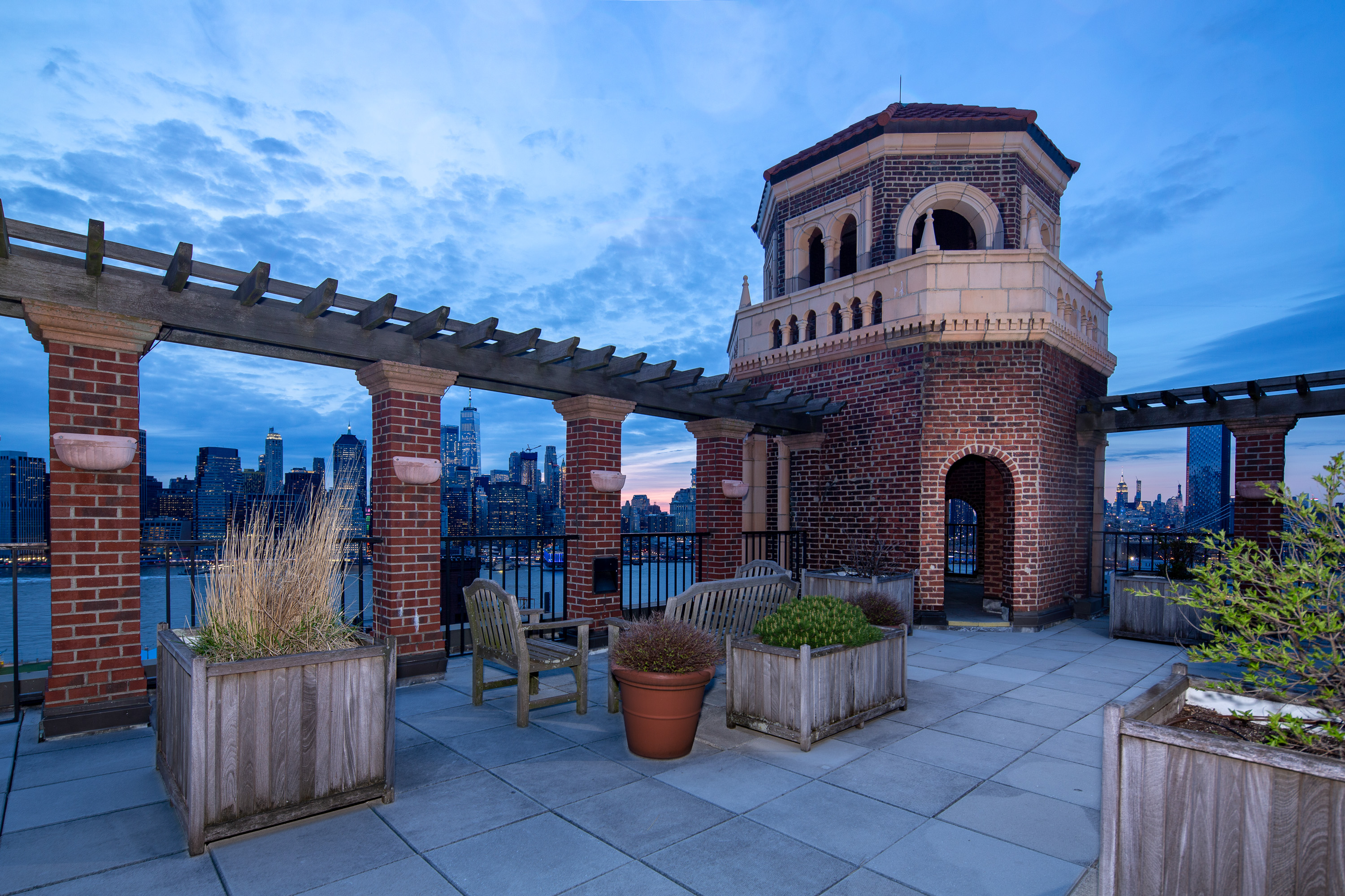
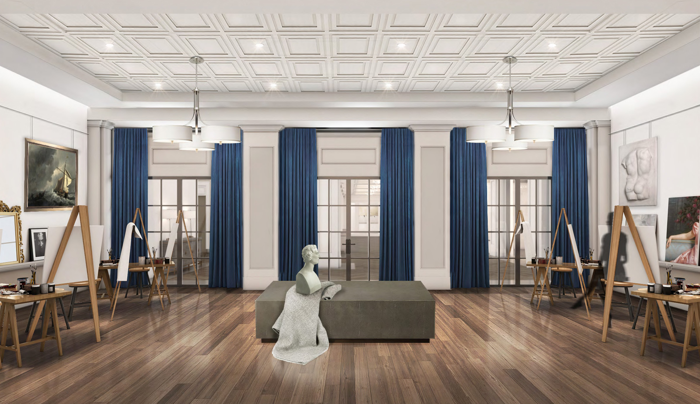
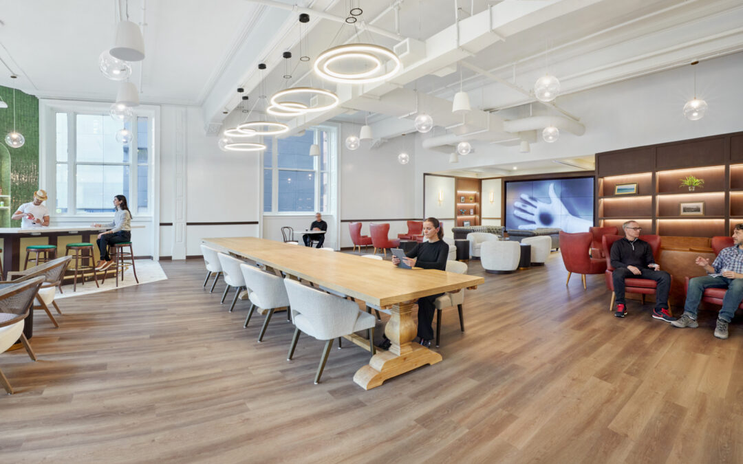
There will also be a yoga studio, spa and gym as well as other, less health-related niceties: rooftop lounges and gardens with harbor and skyline views, a theater, library, art gallery, artist studio, beauty salon and a grand entrance with a lobby and promenade.
The resort-style senior living design aims for wealthier residents, DeMarco says. “This is not where the resident is just trying to find a place to get into,” he says. “Often, it’s children who want to have a parent or parents near them in a more comfortable environment.”
That’s a reasonable market to target in high-density enclaves like New York, though not likely a broader national phenomenon, says Patrick McCormick, partner in the senior care and living practice at Plante Moran, a consultancy. Luxury housing will be a niche part of the larger demand for assisted and independent living facilities from a rising population of older adults—a cohort that won’t peak until next decade, he says.
“There are people willing to spend on a higher-end product with more amenities, so a lot of developers are creating one-stop communities,” he says. “Many of them are trying to appeal to a younger influencer like a child or even a younger senior.”
Planned Demolition
Splitting early bid packages was a major contributor to the project’s early progress, both on design and future construction phases, Tomanek says.
“We knew that we had to do a substantial amount of demo and structural work, so we sped up the package to bid that out,” he says. “That really allowed us to get working [on] the demo while we were finalizing the full construction document package …. There were a lot of advantages from a schedule perspective and from a value engineering perspective—being able to open up walls while we were still in the design phase and the bid phase.”
Completing that work early also gave Hudson Meridian clean interiors to work with, says Peter Monte, the firm’s president and COO.
“The typical experience of unknown, hidden conditions was substantially reduced to the point where it was negligible,” he says. “The ability to start coordinating the project knowing that you’re looking at the bones of the building was a major factor in the success of this project.”
This also gave the team advance knowledge of odd features, such as elevated beams, plumbing pipes and electrical wiring in unexpected places as well as shear walls installed in recent decades to reduce vibrations from subway trains.
The team used a similar approach for selective upgrades to the building’s heating and cooling units, such as installing new high-efficiency boilers and chillers early in the project before decommissioning the old ones, while still reusing original equipment that was still functional, DeMarco says. That work, completed in November 2018, allowed the renovation to proceed with hookups to the new systems.
“It’s a good business model to reduce your exposures if you have the time and opportunity to do it,” he says.
Big Bathtub
The team used similar strategic planning on another major task: installation of a new electrical vault for the property. It could have let Consolidated Edison handle all the work, but that would have left no guarantees on the work schedule, Tomanek says.
“So we did as much of the work as possible, and just counted on ConEd to supply the vaults, the transformers—do the work to bring the power into the building,” he says.
“People are willing to spend on a higher-end product…so a lot of developers are creating one stop communities.” – Patrick McCormick, Partner, Plante Moran
That work was extensive, involving creation of a 100-ft by 20-ft structural “bathtub” holding the vaults. The demo crew first dug out a 1,200-ft space in the cellar and auger-drilled 50 helical micropiles 15 to 30 ft deep in the subcellar and added five large pile caps atop them. From there, the construction team installed 10 columns—two per pile cap—to support the tub, poured concrete for the structure’s walls through openings in the sidewalk and completed most of the electrical connection work.
“Those columns are nestled into the operators’ back of house office space, into the switchgear room,” Tomanek says. “We really had to strategically place those because they weren’t anticipated early on in the design process.”
The massive 11-ft-deep structure now holds the five-sided transformer vault and switchgear, with capacity to also hold rainwater and a fire truck’s weight if necessary. The successful plan resulted in the building getting its new power connection in mid-December, Hughes says.
“I liken it to building a building within a building, between the piles and the tremendous pile caps and 12-inch columns,” he says.
Final Touches
The team used other strategic techniques to ensure construction quality and keep on schedule. One example, Monte says, was building a mock-up bathroom to show crews how the new and old plumbing systems would come together behind the walls and work with finishes for the units, which feature roll-in showers and open-pedestal sinks.
“We figured out coordination issues and the tolerances and quality control issues, and we set a standard for the subs so they could go down to the mock-up unit [to see] this is our expectation of how this is supposed to look,” he says.
That was one of many examples of the team having to marry new and old systems throughout the building across mechanical, electrical, sprinklers and plumbing, Tomanek says. “Starting the demo process early really allowed us to go in and look at the plumbing stacks and all mechanical ductwork and see if we could actually save it,” he says.
The renovation effort also has entailed adding fully compliant ADA access, including such features as movable banquette seating and wide hallways to ensure comfort and mobility for residents.
“We placed an emphasis on allowing freedom of movement and a fully accommodative setting,” DeMarco adds.
Source: ENR New York


MDA is One of the Nation’s Largest Workplace Interior Architecture Firms
Montroy DeMarco Architecture LLP is one of the Nation's Largest Workplace Interior and Interior Fitout Architecture and Architecture Engineering (AE) Firms! Check out Building Design+Construction Magazine's Annual 2024 Giants 400 Report....

Top of the Rock Opens 900 Ft. High Skylift Attraction
Skylift at Top of the Rock, a new attraction atop 30 Rock, elevates visitors nearly 900 feet in the air above street level for a spectacular, entirely unobstructed, 360-degree view of New York City. The design team for the Skylift included owner Tishman Speyer...

Tishman Speyer Properties and Architect Richard J. DeMarco Complete Skylift At Rockefeller Center’s Top Of The Rock
The One-of-a-Kind Attraction Elevates Visitors Nearly 900 Feet Above New York City New York, NY–Skylift at Top of the Rock, a new attraction atop 30 Rock, elevates visitors nearly 900 feet in the air above street level for a spectacular, entirely unobstructed,...
